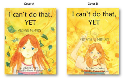
Choosing a cover
We developed two wonderful covers… and asked the facebook community for feedback

Here is some feeback we got
Cover A
- I like the brighter colors in the left-hand cover and the objects floating around provide good power of suggestion, better than what the lightbulb
- Definitely A, as it is bolder and clearer.
- A* but a different expression on the girls face
- cover colors in A stand out more
- I don’t like the face in A too frowny and to gaping
- A for its colors and the girl really stands out.
- I like cover A, it is clearer, but I wish the girl had another expression.
- “A” is too negative. To me the title sounds positive with “Yet” being the key word. So the picture should reflect that.
- cover A stands out a lot better but I do agree with Devorah in that the girls expression should reflect that of cover B in order to reinforce the concept and the title.
- A definately. more eye catching
- I like A better for its composition and color balance – the brighter orange of her hair and the green bits.
- Love A, it looks more intriguing, x
- I like the boldness of color in A
- I like the bolder color.
- A looks too discouraging.
- The girl is bolder. Also those green objects add “life” to cover.
- I do like the green on cover A, and the size of the girl.
- A For sure. Bright and focused!
- I am drawn more to the first one. More colourful and solid x
- I like the how the colours are more vibrant in A,
- A is good too, it just seems like that expression would be good for when Enna starts to really believe in herself.
- A but with a smiling girl
- I like all of the possibilities in option A. You can tell she’s contemplating being a dr, a scientist, and other professions. It provides more of an overall picture to the story. I like option b as well but I feel that it doesn’t show quite as much. She has an idea but the other story shows that she has multiple ideas of what she could be. The possibilities are endless.
Cover B
- B is my favorite since she looks so positive you can hear her say YET
- Cover b. Its more positive.
- More energy in B. I vote for B
- I do like the action of the girl B
- I am not sold on the expression, though, but I’m also not sold on the smile of cover B. Maybe try wistful, or determined? I don’t know
- I prefer the expression on the character’s face in cover B,
- I also like the light bulb in “B”.
- Their parent(s) manages to stumble across your book, I think a smiley front cover may cheer that child up in the first instance.
- B but brighter colors It is more positive
- But I like her expression in B better. Perhaps some tweaking of B would work best
- I think if “B” had more colour to contrast the nice yellow background it would also catch the eye.
- agree that the expression in B is more positive.
- B, but better outlining would make her stand out better and maybe more colors would make her stand out from the background.
- B shows that she has the mindset and belief to achieve the goal!
- I like A better * B feels too busy to me.
- pose and positivity of expression in B i like better
- make b more color in hair
- B * Positive facial expression. Maybe YET more pronounced
- B, feels more inviting, positive
- b looks like yea I can’t do it now but SOON I will
- It is about growth mindset. The title words can be insiprational or defeatist depending on how you intepret it. The girl and cover colors need to inspire (or be happy/cheerful) in order to lead people to the inspirational interpretation which is why I like B better because the girl is smiling. Just my $0.02 worth
- I really like the cheerful expression in B. Also, the lightbulb in B helps draw attention to the message of “growth mindset”. I think Enna’s happy face in B will help give the reader a more hopeful impression of what the outcome/ending will be.
Overall advice:
- Combine the two if possible
- A color contrast stands out more
- Also, I wonder if a dash rather than a comma would emphasize that YET.
- For example “A” has green in the background bit “B” has more yellow. Also the girls hair is lighter in “B” if it were darker like “A”. Those colour changes would make a difference.However, if changes can’t be made at this point I would still go with “B” Images and words will form opinions in the Childs mind before they get a chance to read the book. It may offset their perceptions of the books meaning.Younger children may base their ideas off of, and learn, from images alone.
- SUGGESTIONS: Color match B with A’s color.
- I think A captures the tone of the title more, but B seems more positive. It depends on what you are going for
- I like A but with a small light bulb to the side and more of B’s expression.
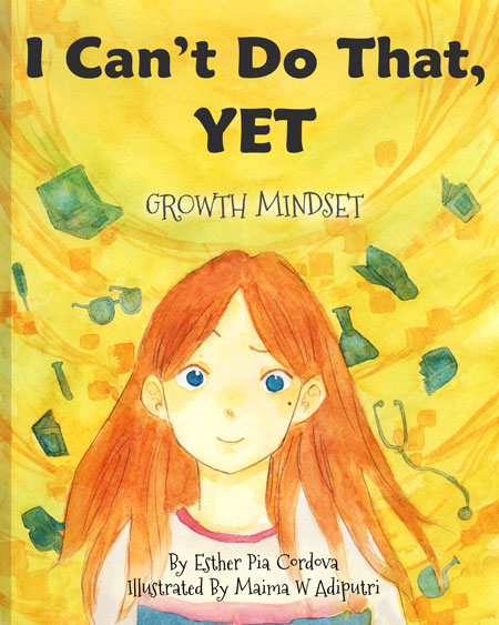
And this is the final cover
After taking in all the great feedback I’m happy to show the final cover. A lot of people preferred the bolder and brighter colors in cover A, but liked the positivity and energy of cover B.
So the final cover will be a combination of cover A and cover B.
We gave the art work last touch ups, added a smile on Enna and made sure the fonts are better readable. I hope you guys will love it. I’m in love with it.